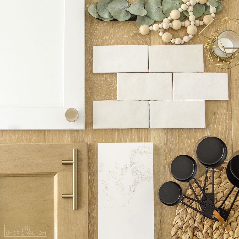
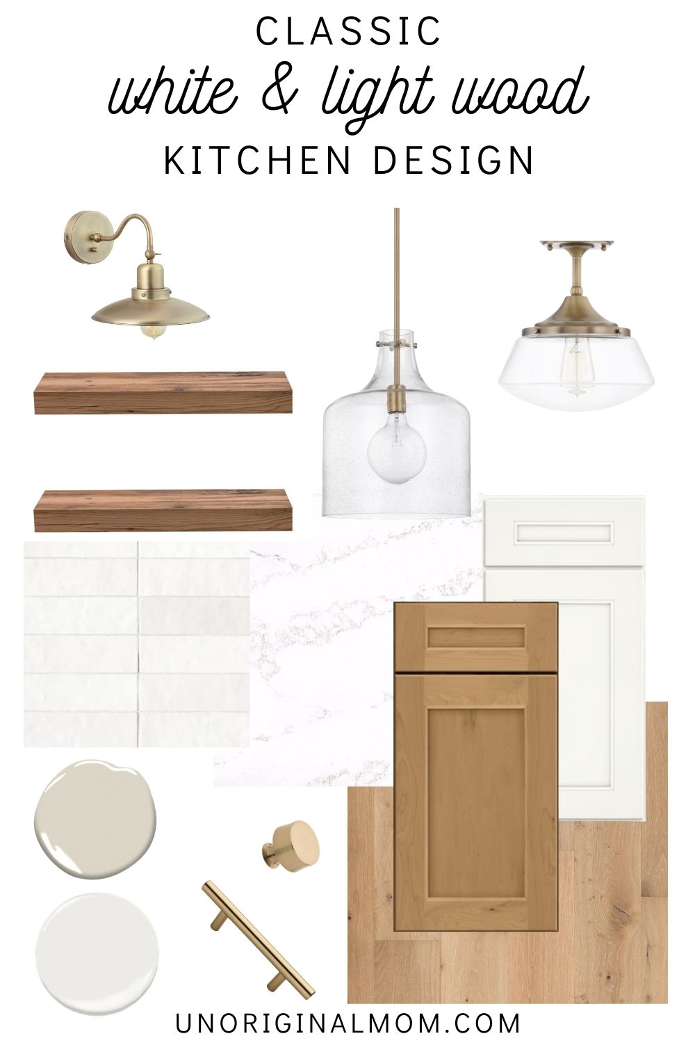
This classic white & light wood kitchen design centers around timeless elements with a modern twist. Full overlay white cabinets are warmed up with a light wood kitchen island, and traditional subway tile gets an upgrade to the subtle color variation of the Cloe backsplash tile. It’s all tied together by a crisp white quartz countertop with warm amber and gold veining, plus trendy gold hardware plus modern gold light fixtures give this space a bit of glam!
If you haven’t already seen the post about our major home renovation, we’re in the midst of completely gutting the first floor of our 1995 builder grade home to turn this into our “forever house!” You can read more about all the things we’re changing and see more before photos in this post. The biggest change is the mudroom/laundry room/pantry/powder room addition that we had put into the back of our existing garage, but we’re also taking our kitchen back to the studs (and knocking out a few walls) to make the kitchen of my dreams!
KITCHEN RENOVATION LAYOUT AND FLOOR PLAN
Ohhhhh, I am SO excited for this new kitchen! Not just because it will look pretty, but because it will be a MAJOR transformation in the efficiency of this space. Here are a few “before” pictures to give you a sense of the current layout.

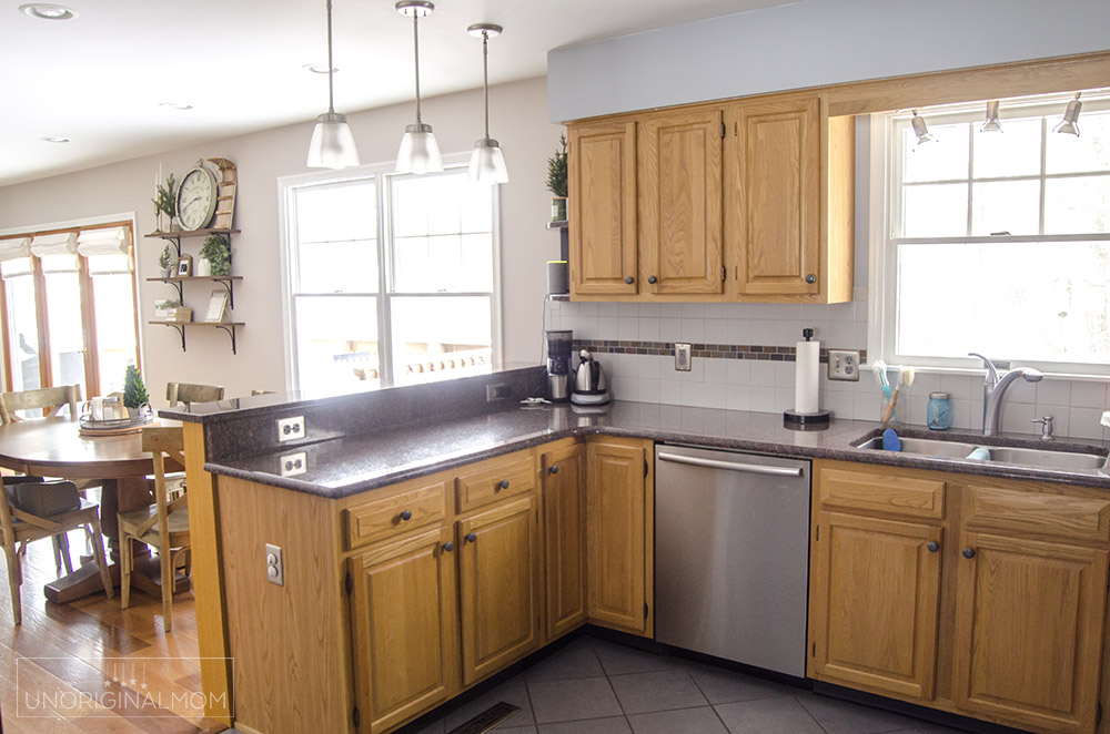
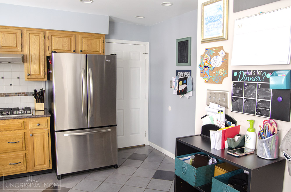
And here’s the new floor plan! For reference, the fridge (top right corner) is on top of our current half bathroom, and the beverage center (bottom right) is where our current wall oven/pantry is now. By knocking down those walls, we’ll be able to completely transform the layout of our kitchen and make it feel MUCH bigger! Not to mention, tearing out the soffit and taking the cabinetry all the way to the ceiling will maximize storage and make the whole space look larger.

Let me walk you through the space, starting on the left wall and working around clockwise. First of all, the sink is staying where it is underneath the existing window, with upper and lower cabinets on both sides. The dishwasher isn’t moving either. We’ll be bringing the backsplash all the way up around the window to the ceiling, and adding a semi-flush mount light above the sink.
Moving to the right, the new doorway into the addition is going to be about where our stovetop is now, so everything is getting shifted down. We splurged on a Cafe Gas Range with double oven – eeek! That will definitely be a showstopper element of the kitchen. Our contractors are going to build a simple custom wood range hood that we can paint to match the cabinets, and it will be flanked on either side with open wood shelving the same color as the island and brass sconces above.
The doorway on the right leads to what used to be our dining room (we’re changing it into our music room/office), and next to that is a small beverage center. The upper cabinet will be glass front for displaying glassware and coffee mugs, and we’re adding a small beverage fridge under the counter there. I’m really looking forward to having a separate spot to keep all our coffee paraphernalia so it doesn’t clutter up the rest of the countertops!
Finally, a nice big beautiful island. It’s not as big as I’d wish for in a new build, but I’m still thrilled to be able to get an island big enough to seat all three kids! It’s 6 ft by 3 ft – just slightly larger than our current peninsula, but it’s all one level so it will have plenty of work space.
So…can you picture it? For a 1995 builder grade home, this is going to be quite the upgrade. I’m so grateful for our amazing contractors who took our crazy ideas, added their own better ones, and worked them into this genius floor plan!
CLASSIC WHITE & LIGHT WOOD KITCHEN – DESIGN
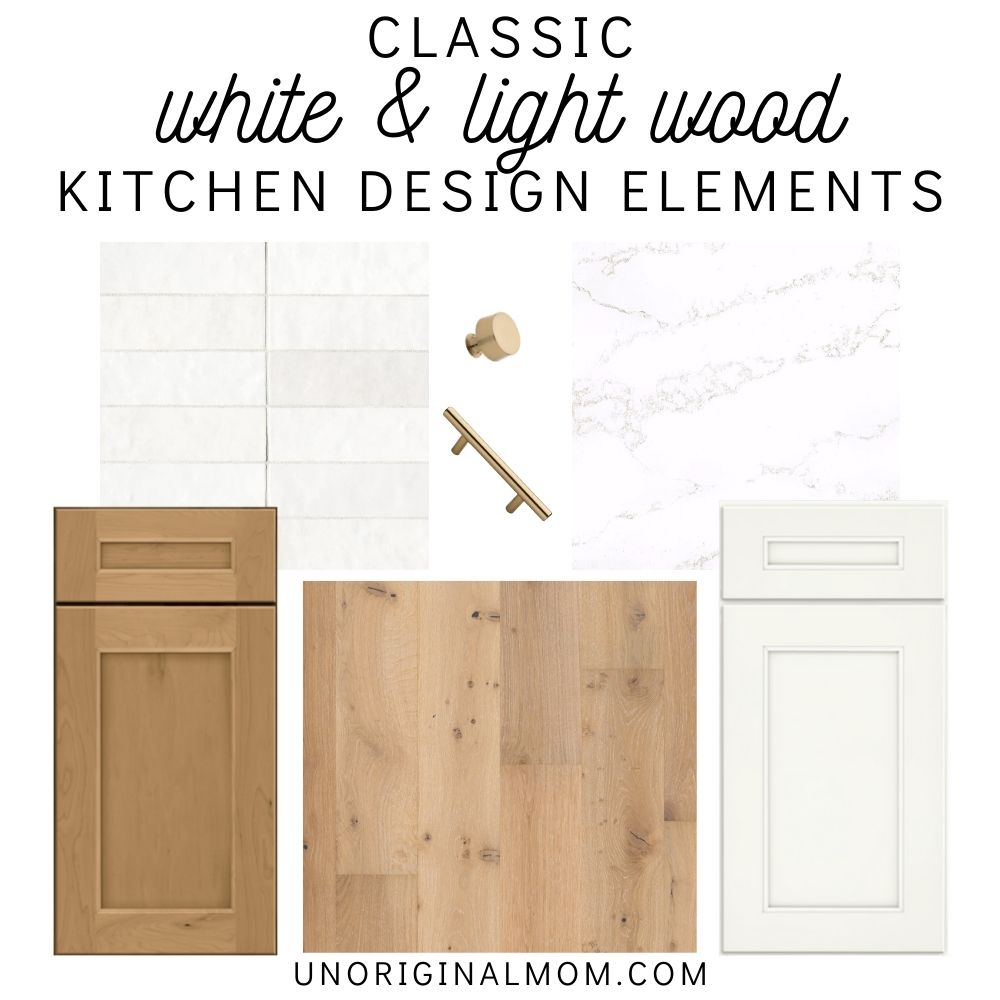
All the design decisions in our major home renovation have centered around and spiraled outward from this brand new custom kitchen. It’s interesting, because originally I was drawn towards the idea of either an all-white kitchen or maybe a two-tone look with painted cabinets in a light gray, blue, or taupe color. I knew that I wanted to go mostly white, not only for the light and clean feeling of a white kitchen, but also for the its timeless and classic characteristics. We’re only doing this kitchen once, so I want it to last! The light wood cabinetry wasn’t even on my radar until I saw the stained cabinet door sample and fell in love with it. Both my husband and I really liked idea of adding in some warmth to the kitchen with a light wood island. Everything else sort of fell into place from there!
The next big decision after cabinetry was flooring, and we ended up deciding on a light oak engineered hardwood that closely relates to the island color. They’re beautiful, but still have some knots and texture to help feel more casual and disguise the wear and tear of three kids and a dog. In the interest of longevity and classic style, they’re also not quite as light and whitewashed as a lot of the flooring that’s trendy right now. Even though I really like that look, I wanted something that wouldn’t feel dated or out of style ten years from now.
When it came time to selecting countertops, we were immediately drawn to the Hanstone Strato quartz sample. The warms of the amber and gold veining went so beautifully with the wood tone of our island cabinets, but the crisp white marble look will be perfect with our bright white cabinets!
The backsplash tile was a bit trickier. In keeping with the timeless and classic feel, I didn’t want to go with anything too bold or trendy so subway tile seemed to be the best option…but I didn’t really want to settle for regular old plain subway tile. I really like the handcrafted, dimensional look of zellige tile, but that price point was way too high for us, plus I think it would be impossible to clean! I stumbled across the Cloe white subway tile by Bedrosian and was immediately smitten. It has a nice shine, a slightly imperfect shape, and lots of subtle variation in color. It’s a real chameleon and can look totally different depending on the grout and the context, so I wasn’t entirely sure how it would work with our cabinets and countertop, but once the sample arrived I knew it was the one! I am SO excited to see this tile up on the wall. I think it will add so much interest and dimension to the space!
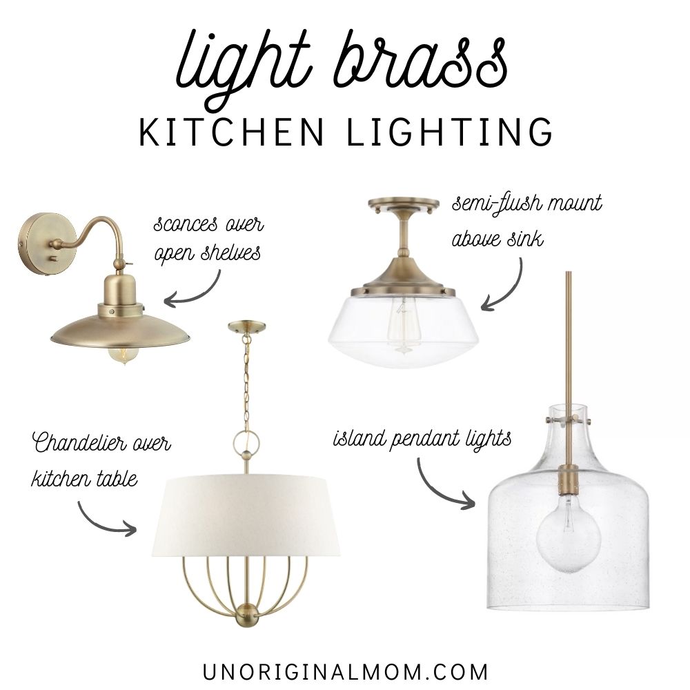
Lighting. Oh my, lighting was probably my least favorite part of the kitchen design process, simply because there are SO many options and price points! Not to mention the enormous challenge of matching brass colors. Because we’re going with more of a champagne gold color on our cabinet hardware, we had to stick with lighter aged brass fixtures instead of more dark gold/antique brass fixtures. That’s a whole lot harder than it looks! Thankfully, my friend and neighbor Marisa from A Lovely Living helped steer me in the right direction. We picked out pendants for the island, sconces for above the open shelving, a semi-flush mount for above the sink, and a chandelier for over the kitchen table. I think they all compliment each other nicely without being too matchy-matchy. And the nice thing about light fixtures – and cabinet hardware for that matter – is that they’re really easy to swap out. It’s reassuring to know if we ever tire of all the gold accents, we can change up the look of the whole kitchen by switching the lights and hardware!
CLASSIC WHITE & LIGHT WOOD KITCHEN DESIGN – SOURCES
Curious about the specific products we’re using? Here’s a list of the exact items we’ve ordered to use in our classic white and light wood kitchen!
- Flooring – Shaw Castlewood Oak in Chatelaine
- Cabinets – Merillat Classic Collection – Glenrock profile in Cotton and Boardwalk
- Countertops – Hanstone Strato Quartz
- Backsplash – Bedrosian White Cloe tile in 2.5×8
- Hardware – Liberty Champagne Bronze pulls & knobs
- Lighting – pendants / sconces / semi-flush mount / chandelier
- Paint – walls will be Natural Cream (Ben Moore) and trim will be Pure White (Sherwin)
Want to see this kitchen come together in real time? Make sure you’re following along via Instagram to see updates in my stories! I can’t wait to publish the “big reveal” here when it’s all done!


Get your copy of my FREE meal planning binder!

Sign up to get a free copy of my meal planning system - an 11 page printable meal planning binder, complete with a pantry inventory, shopping list, and more to help get on top of your menu each week!



It’s going to look beautiful! 😍
Should be bright and open.
Love it! Your kitchen is in pretty great condition as it though. I would hate for you to see my kitchen! Look forward to seeing the transformation.
Gorgeous! Is there a way to see your finished project? What kind of sink and fixture did you choose?
Thank you!! I am working on the official “after” blog post (hopefully it will be ready soon!), but in the meantime there’s more on my Instagram! There’s a photo in my feed with a before-and-after view of the kitchen, and also a full video your in my Instagram highlights. instagram.com/unoriginalmom
Really like the kitchen design in this style as I love white. It’s both classy and clean. Thanks for sharing.
How do you make the pic collage of all the items together? I am trying to put together some items online for my house and this would be so helpful to see how well the go together. By the way your choices are beautiful.
Thanks Crystal! I use photoshop to remove the background of the images and then arrange them together. There are other programs out there that will work, too…you might be able to find some tutorials on Pinterest if you search something like “mood board tutorial” :-)
Looks lovely! I’m excited for the full blog post. Can you tell me more about the shelves: size, color, where you purchased them from, etc?
Sorry, that “reveal” blog post has very slow in the making…maybe someday I’ll finally get around to it! In the meantime, you can see a full video tour of the finished space in my instagram story highlights. The shelves on either side of our range were custom made and stained with a custom mix of stain, but they are 11″ deep and 23″ wide. Hope that helps!
What stain color are the cabinets?
This piece is a treasure trove of useful tips for readers looking to improve their understanding.
This kitchen renovation sounds amazing! The combination of classic white and light wood, along with the trendy touches like gold hardware and fixtures, will make it truly special. Can’t wait to see the after pics!
Your kitchen renovation sounds amazing! The blend of white cabinets with a light wood island and the Cloe backsplash tile is a brilliant choice. The gold accents add a touch of glam to the space. I can’t wait to see how everything turns out! Wishing you all the best with your forever house transformation.