Before and after photos of our builder grade 90s colonial exterior renovation including a garage extension, standing seam steel roof accents, and front porch refresh, all with touches of craftsman style.
We made it!! Our major house renovation is complete, and I am FINALLY getting around to getting the first blog post up. I apologize to any of you who have been patiently waiting and checking for updates over these past few months! I’ve decided that “renovation hangover” is a real thing, haha. But seriously, it’s taken quite a while to feel recovered from the entire process…all of the planning and designing, packing, moving out of our house for 5 weeks, moving back in amidst continued construction, unpacking, decorating, and settling in…it was an exhausting 6 months!
The construction started in late January and the bulk of the work was completed by mid-May, but because of continued supply chain issues we’re actually still waiting on a few small odds and ends in the kitchen, which is why I haven’t gotten around to photographing and blogging about the interior quite yet. Also, let’s be honest, decorating an entire first floor is a really daunting task! It’s going to be an evolving process, but we finally have most of our furniture in place, so I’m really hoping to be able to get the interior “after” photos taken and posted for you in the next few weeks. Though if you’re really itching to see what it looks like, I’ve got a video tour of the kitchen saved on my Instagram highlights ;-)
90s COLONIAL EXTERIOR RENOVATION – THE REVEAL!
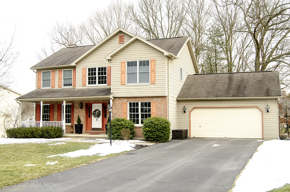
Even though the exterior work has been done for a few months now, the landscaping was a MESS! It took us a while to get our act together enough to rip out the old landscaping ourselves and get some new stuff planted. We still have some more landscaping to fill in this fall and next spring, but it’s good enough for now! Just as a reminder, here’s what we started with…a builder grade 90s colonial with good bones, but desperately in need of a face lift.

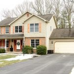
Here’s what it looks like now!
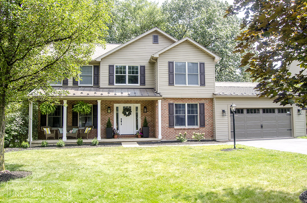
It doesn’t even look like the same house, does it???
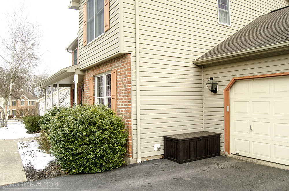
As a reminder, the biggest motivation for this renovation in the first place was the addition we were putting into the back of our garage. (You can read all about the design and see the floor plans in this “before” post.) In order to put a finished addition into the back of the existing garage, we had to build the garage forward into the driveway by about 10 feet. Here’s a side view of the house before – see how the front of the garage is set back from the front corner of the house?
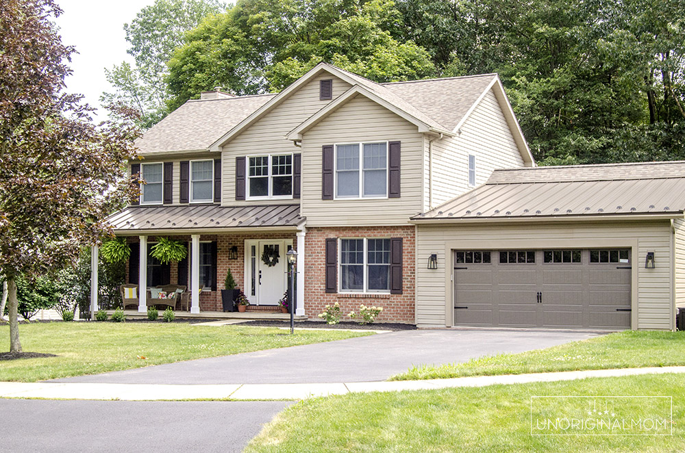
Here’s what it looks like now – notice how the garage now extends just a bit past the front edge of the house.
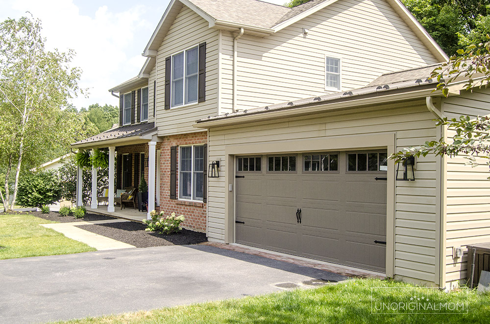
If you didn’t know the garage used to be set back, I don’t think you’d ever realize this house had been added onto! The new facade still looks very balanced and purposeful, which is great for curb appeal and resale. (Though we’re planning on staying here for quite a while!)
Rather than replace the siding on the whole house, since it was still in good shape, we opted to keep it and have our builders just purchase new siding to match. They took off the siding from the side of the garage and used those pieces to fill in the front and back, since the old siding was a little bit worn and faded and patching with brand new siding would be more noticeable. All the new siding went on the right side of the garage. Honestly, I can’t tell the difference! The garage door is new as well, and since we got rid of the man door and a window in the rear of the garage, we opted for window in the garage door to let in some natural light. I really like the look!
As part of the new design, we decided to get rid of the porch railing and have our builders build up the porch posts for a cleaner, more craftsman style look. Before, the front porch felt really small, but taking the railing down (and pulling out the shrubs) has really made it feel larger and so much more pleasant to sit on! Not to mention it’s much easier to sweep off and keep clean. We’ve found that we actually go out and sit on the porch a lot more than we used to!
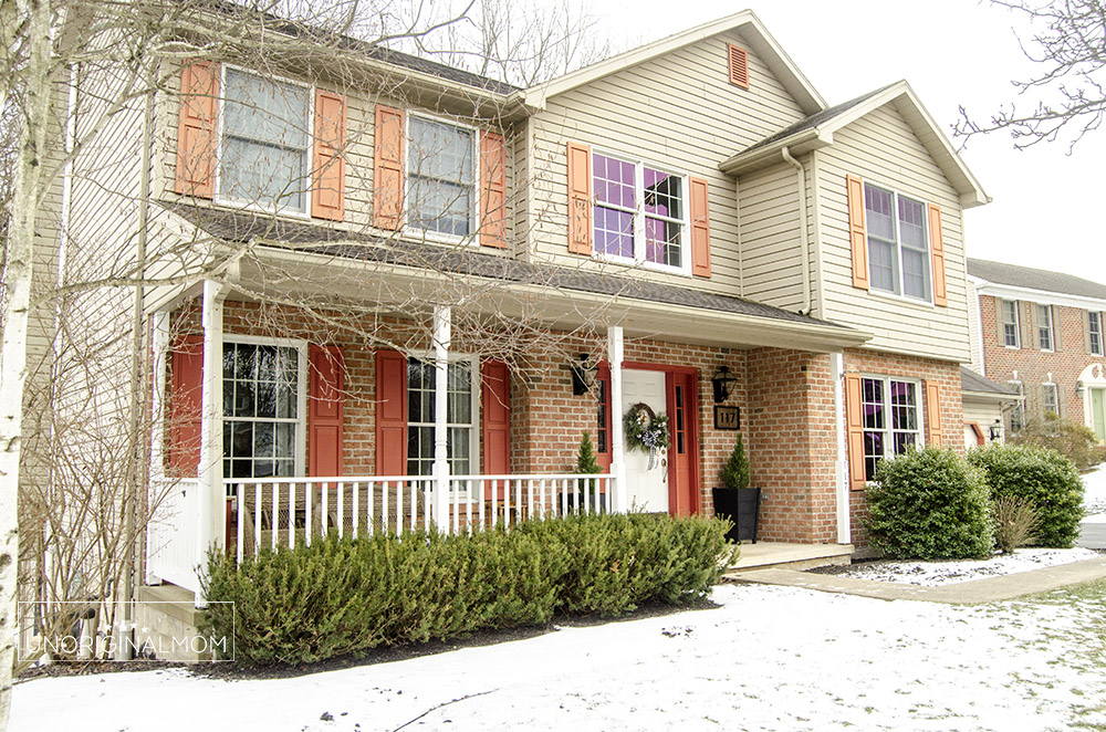
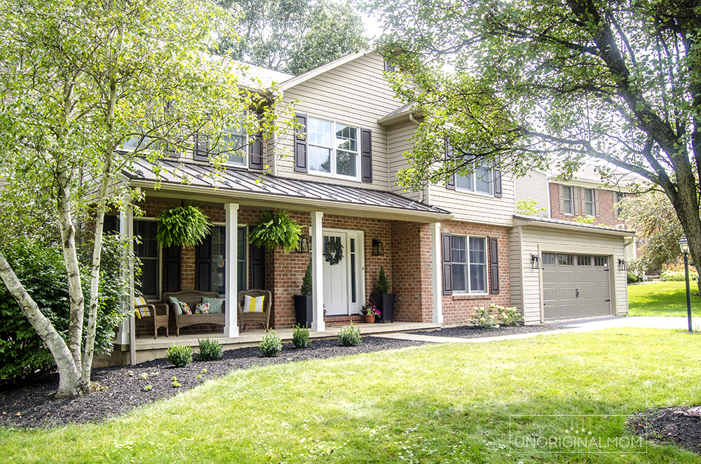
Speaking of the front porch, we also replaced the front door with something in a more craftsman style. Originally we were going to paint it a darker slate blue-gray. When the door was installed before it was painted, the primed white actually looked really great with the rest of the house! You can see how it pulls together the white of the porch railing with the white window trim, and also helps to balance the darker garage door. It took a little bit of convincing from my friend and neighbor Marisa (she’s the one who helped to pick out all the exterior finishes and light fixtures!), but eventually we decided to keep it white. Though I can’t promise it will stay that way forever ;-)
Another big change was the shutters. Honestly, I think that made the biggest difference! As soon as they took down the old orange shutters and put up the new ones, I was amazed at how the tone of the brick looked completely different. And of course, the star of the show is the standing seam steel roof accents Once we decided to use it on the addition portion of the front of the garage, it made sense to balance it out by using it on the porch roof as well. The rest of the roof was replaced with architectural shingles. I think the steel accents makes the house look like a new build!
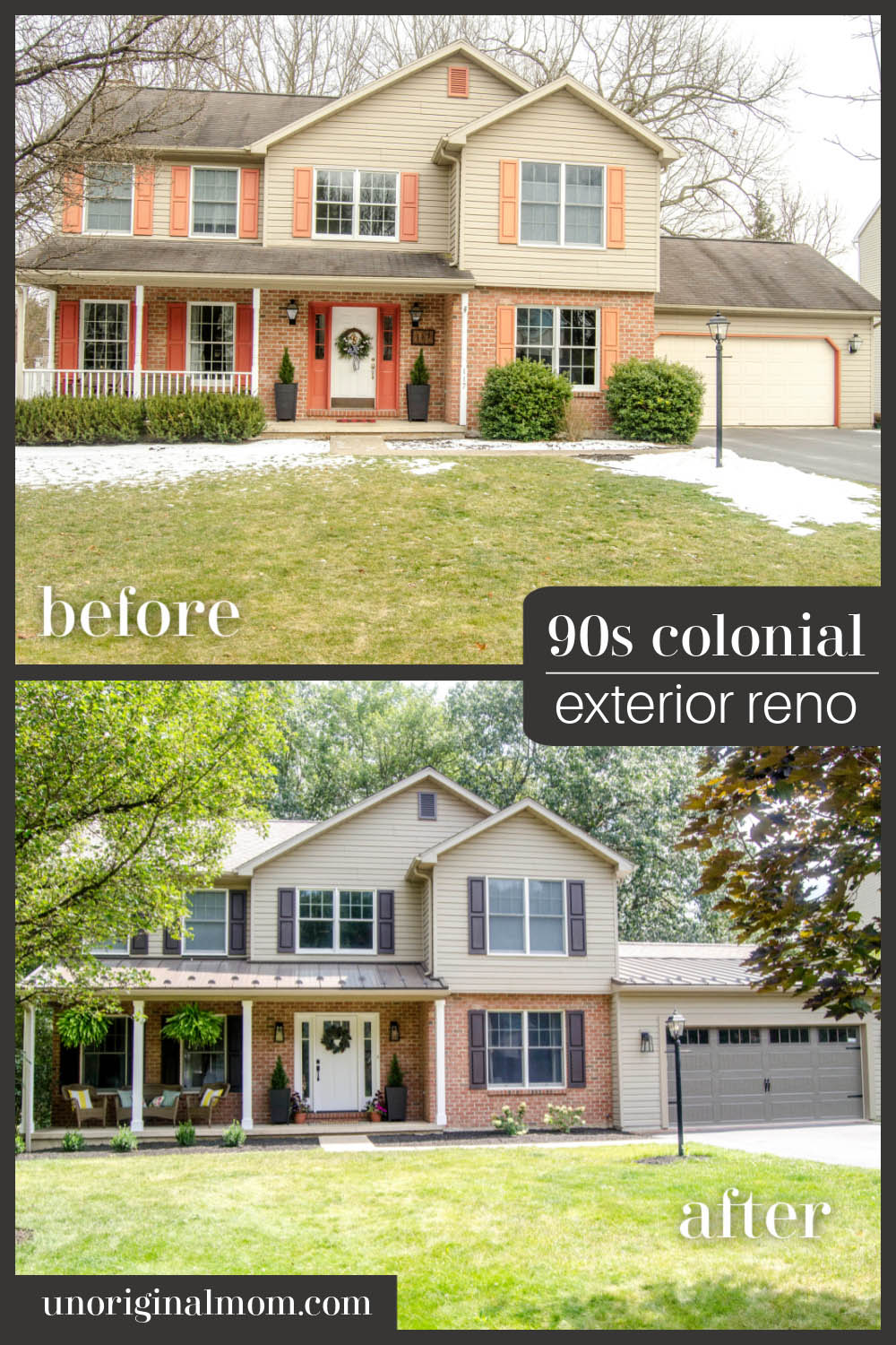
90s COLONIAL EXTERIOR RENOVATION – BEFORE & AFTER
Once last comparison shot, because the transformation is just too good!
I’m planning on putting together a few more renovation related posts for you, including a Q&A of the whole process…so if you have any questions, leave a comment for me. And don’t forget to check back here in a few weeks for the interior reveal!


Get your copy of my FREE meal planning binder!

Sign up to get a free copy of my meal planning system - an 11 page printable meal planning binder, complete with a pantry inventory, shopping list, and more to help get on top of your menu each week!





Beautiful exterior renovation, Meredith. Would love to know the color of the siding and garage door. I have a 1951 brick ranch with similar to your color of brick and roof. This is the year to update my exterior. I bought the house three years ago and the color scheme was all white trim with the red brick. Boring! I like the colors of nature, so woodland greens and dark browns/grays, adding color with flowers and flowering scrubs. So I love the color of your siding and especially the garage door. Also like the standing seam metal roofing, but that will have to wait until I can rebuild my savings account! :-)
If you would provide the colors of your siding/garage door and shutters it would be most appreciated. Thanks.
Thanks so much, Sharma! The siding is actually original vinyl siding from our builder grade 1995 house…it’s not painted, so I don’t have a specific color name to be able to share. The shutters and garage door are also vinyl, not painted – they’re just the colors we selected from the manufacturer. Unfortunately I don’t have the information for those, either, sorry! If it helps, we were looking for colors in the beige/brown family rather than the blue-gray or green-gray family, so that it would all work with the red/browns of the brick. In fact, our color consultant looked for one of the darkest bricks on our exterior and held up paint swatches to find something that was a close match to it, and then used that as her basis for selecting the shutters, roof, and garage door. Hope that’s helpful for you!
Beautiful renovation.The exterior of your house looked wonderful even before.
Do you have a post showing your kitchen reno completed??
Hi there! I just haven’t gotten around to that yet (bad blogger, I know!), but there is a video tour saved in my story highlights on my Instagram account!
I love the new exterior. It looks so much more modern and stylish.
Wow, your exterior renovation is truly stunning! The transformation from a builder grade 90s colonial to a stylish craftsman style is remarkable. I can only imagine the hard work and dedication that went into this project. Your attention to detail is evident in the garage extension and steel roof accents. Can’t wait to see the interior photos soon!
What an amazing transformation! The exterior renovation, especially the garage extension and standing seam steel roof accents, looks fantastic. Can’t wait to see the interior photos. Your 6 – month journey sounds intense but so worth it!