If you missed last week’s post, I’m making over our music room as part of the One Room Challenge! Make sure you head over there first to get the full run-down on the challenge, see all the “before” pictures and design board, and hear all about my plans for this space!

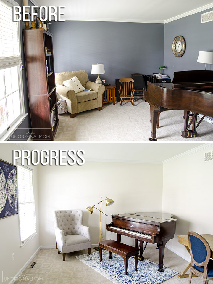
I have a really dramatic transformation to show you today…we painted our music room, and the difference is truly amazing! I just can’t get over how much of a change there is in this room since we lightened up the walls and moved the piano. As a quick reminder, here’s what the room looked like originally:
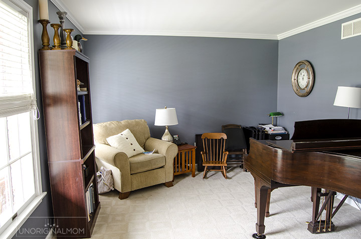
First step: deciding on a paint color. Never an easy task. I already had this amazing rug, plus I knew I wanted to lighten up the room. But I also did like the blue that was already on the wall…so initially I was looking at blue-grays just a shade or two lighter than the original wall color. I’m SO thankful I called in my friend and neighbor, Marisa, so take a look. She’s a fashion blogger with immaculate taste and a terrific eye for color and design, so she was able to suggest something that wasn’t really on my radar – white. I bought a few paint samples (I wasn’t totally convinced about the white!), primed two spots of the wall with a tinted gray primer, and slapped up 4 different colors (all from Sherwin Williams):
- Alabaster
- Mindful Gray
- Shoji White
- Accessible Beige
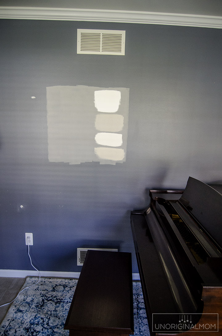
And here they are next to the trim:
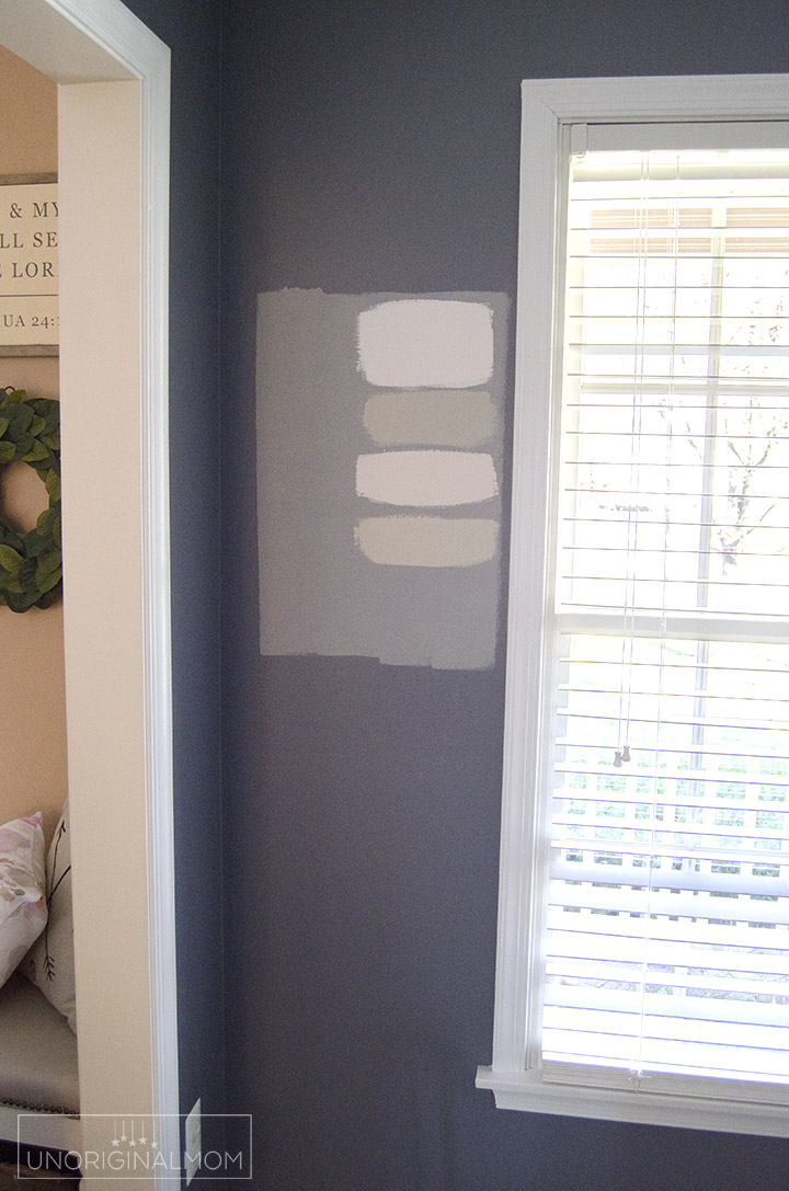
It’s hard to get a real sense for these colors on a computer screen, but in person, it was a really easy pick which color was going to marry the rug, carpet and piano, and give it that airy farmhouse feel I was wanting – Shoji White! (Luckily Marisa and I were in agreement!)
Hubby recruited some neighbors to help us move the piano into the middle of the room, and we started painting away. Here’s what the room looked like after 1 coat of primer – so much of a change already!
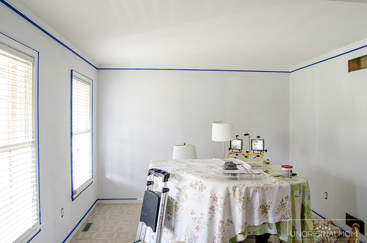
And here’s what it looked like after the first coat of Sherwin Williams Shoji White:
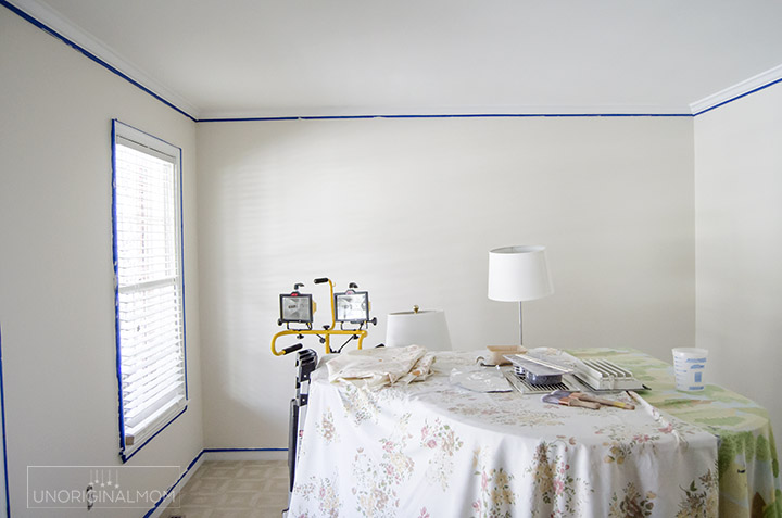
Ahhh….so much better, don’t you think? Shoji White is a creamy, warm, soft white with greige undertones. It was the perfect color to let the beautiful dark wood of the piano take center stage while also pulling in the cream color from the rug. But before I let you see the “after” picture (I know, I’m such a tease), I want to talk a little bit about my plan for the room layout.
During the planning stages of this room makeover, I spent a little bit of time (okay, a LOT of time) working on a new layout for our room. The biggest challenge, of course, is that beautiful 1938 Steinway baby grand piano. It’s not like I can just try a bunch of different furniture arrangements until I find something that works, seeing as how it takes 3 grown men to even slide the piano a few inches. So I went old school and worked out my furniture placement with graph paper! Each square of graph paper equals 10 inches, so I was able to use the dimensions of the furniture I was considering to play around with different arrangements. I knew I wanted a little reading nook by the window, which meant the opposite corner of the room would become our office area. Ultimately, this is what I decided on!
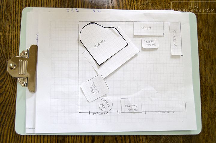
If you aren’t familiar with grand pianos, the lid is hinged on the left side (as you’re sitting at the piano). We don’t put the lid on a stick very often, but we definitely wanted to have that option, so putting the right side against a wall wasn’t a possibility. So really, keeping it where it was or putting it in the far corner of the room away from the doorway and the windows were our only choices. I was able to save a little bit of space and make the piano the true focus of the room by angling it into the corner rather than having it flush against the wall. When we moved the piano into that spot, it’s like the entire room burst into song – that’s where it was meant to be!
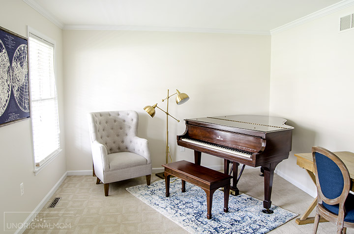
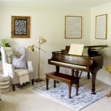
And how perfect is the paint color with the rug and the piano?
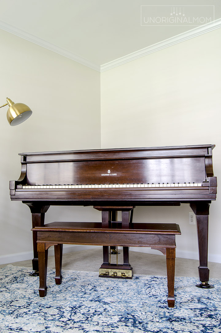
So you can see from the photo that I’ve already got some of our new furniture pieces in place (more details on those later), including our AMAZING new lamp from Lamps Plus! Isn’t it fabulous?
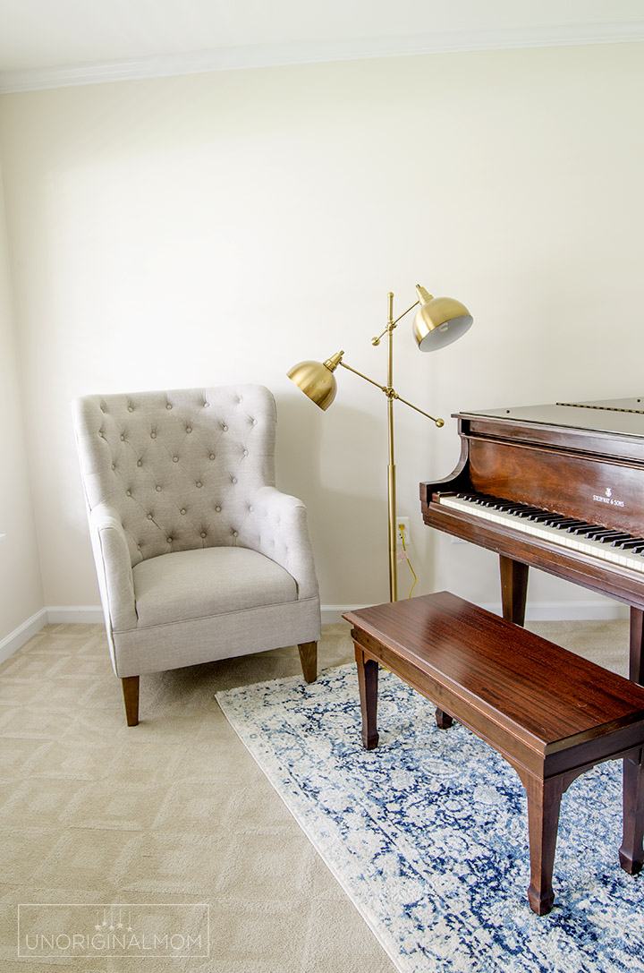
There is still lots to do in here…some kind of storage piece to go between the windows, window treatments, pipe shelving, and of course lots of wall decor. But I still can’t believe the transformation of this room with just a coat of paint and a new layout!
The next step in this makeover is the DIY wall mounted industrial pipe shelving…I’ll be sharing all about that next week, so be sure to subscribe so you don’t miss the update! I can’t wait!
UPDATE – browse all of my Music Room/Office Makeover posts here!
 ORC #5: Farmhouse Cabinet Makeover
If you’d like to see some more home decor inspiration, pop over to see the progress of all the other bloggers in Week 2 of the One Room Challenge.


Get your copy of my FREE meal planning binder!

Sign up to get a free copy of my meal planning system - an 11 page printable meal planning binder, complete with a pantry inventory, shopping list, and more to help get on top of your menu each week!

 ORC #1 - Music Room Mood Board and Design Plan
 ORC #2 - Paint and a New Layout
 ORC #3: Styled Pipe Shelves
 Industrial Pipe Shelving Tutorial
 ORC #4: Farmhouse Hymn Art
 ORC #6: Industrial Farmhouse Office REVEAL!



It’s looking so great! Found you through the One Room Challenge link up!
Shoji White just might be my fav new off-white. It looks amazing in this room! And that piano! Swoon! Fun fact. I was going to be a piano major in college unti my left hand was broken. So your space is super special to me. Can’t wait to see more! Susie from The Chelsea Project
I’m in love with this room already. That bright white paint is perfect and I’m swooning over that gold double lamp. Can’t wait to see more of this space.
As a pianist, shouldn’t the piano face the room?
If I was a true pianist, I might be more concerned about that ;-) It’s a family piano and it’s more important for me to be able to sit down at the piano easily with my daughter, and visually I love how it’s so inviting to come sit down and play! It’s the best use of space for our room too, since it also has to double as an office. But if I were using the room to give voice lessons or something like that, you’re right, I’d probably turn it the other way.
Wow, at first I was like, what’s wrong with the before room? And I’m not like crazy about white walls, but honestly, it looks so open and bright. I’m impressed. I’m convinced. This would look awesome in my house. And now I’m also convinced I need a piano too. Thanks for the inspiration. Looks gorgeous. -Emily
We want to use Shoji White on our walls, but want there to be some constrast with the trim color. Yours looks good! What trim color did you use with your Shoji White walls?
Hi Ann, I honestly don’t know the exact shade of our trim (they were like this when we moved in) but it’s a pretty typical clean white trim color, nothing out of the ordinary. Shoji is such a creamy white/light beige (even more so in person than it looks in these photos) that I think any shade of white trim will pop against it. But I am a big fan of paint samples, so I’d recommend testing out a spot next to your trim before you commit to make sure you like it!
can you tell me what the carpet is in the room – it looks good with shoji. Thanks!